
16 . 05 . 2023
#FORDATAteam Fordata - we are changing for you, about the brand's rebranding
16 . 05 . 2023
- When the market benchmark is not enough - how to find your UPV in a product as similar as Virtual Data Room designed for the M&A industry
- How did it start?
- Fordata - we're changing for you, a new approach to brand language
- So, how can we describe ourselves?
- Choosing a branding studio and key visual
- Elements of Fordata brand visual identity
- Fordata - more than technology. We invested in the team
- FOR speed, FOR security, FOR peace of mind, FOR you - Fordata
When the market benchmark is not enough - how to find your UPV in a product as similar as Virtual Data Room designed for the M&A industry
Where do most companies start their rebranding changes? With a benchmark of the industry? But what if other brands in your industry communicate in a very similar way, and on top of that, you compete with global players and fight for the same client while maintaining the boutique nature of your organization? You have to go beyond the industry scheme. Stand out on your unique values.
How did it start?
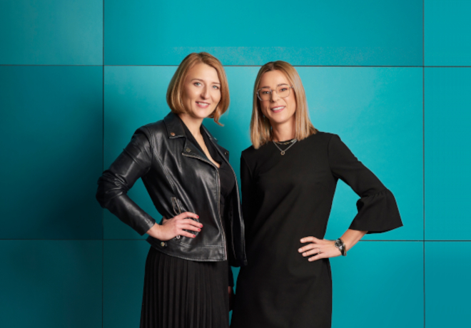
I knew from the beginning that I joined a company with a unique organizational culture. A great, dynamic, young, and open-minded team, with the highest standards of expected professionalism and a partnership approach to the client. The goal was simple. Show it to others through visual identification. Fordata has already had 14 years of experience, clients from all over the world, and has become a key Virtual Data Room provider in Europe. Over the years, it has changed, introducing the product into new markets. Together with Aleksandra Prusator, Sales & Marketing Director, the co-founder, we came to the conclusion that it was time for changes, and the previous visual identity had depreciated. It was time to show the world the new face of Fordata, taking into account the brand’s key values.
We started with conducting internal workshops. Their aim was to create a new tone of brand communication, a tone of voice and a main message, to emphasize the brand’s UPV (unique value proposition). Fordata’s founders perfectly knew what was the “Why?” of conducting this business and what mission drives us. Each member of the team also subconsciously noticed the key values resulting from the strong organizational culture. We also knew what our clients value us for. We had to find a common denominator, define and name it, and then show the world “Who is Fordata and the people behind this brand.”
Fordata - we're changing for you, a new approach to brand language
The foundation for all changes in brand communication was the creation of a cohesive tone of voice – a set of language rules for the brand. For the brand to be understandable to the audience, there must be strict coherence between communication design, brand values, and the audience. One thing was certain – we wanted to be closer to our clients and work for them. That’s why in our marketing communication, we opted to directly address our audience in the first person plural – “Hi, it’s #FORDATAteam,” while maintaining the highest standards of business etiquette. We focused on simple, understandable language that shows our transparency, with no empty promises and a clear message.
So, how can we describe ourselves?
We are a top Virtual Data Room provider in Europe. We know our clients by name. We work quickly. We are here for you. This is the essence of #FORDATAteam and how we operate. It has also become our reason to believe – a promise we make to our clients.
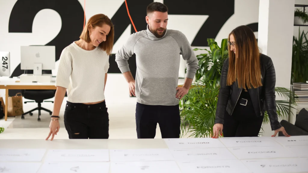
Choosing a branding studio and key visual
Words are nothing without the right visual representation. We needed a fresh, modern, yet still in line with our visual identity style. We briefed the best branding studios in the country, and we chose 247Studio. And so, at the foot of the Gdynia marina, in an industrial design studio, our adventure began…
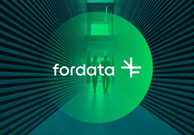
One of the presented key visuals particularly stuck in our memory. Mountains, nature, and tranquility embodied “peace of mind” – the promise we give to the client. This image reflects our philosophy, contains a feminine element combined with technology and a reference to our previous brand identity, which we didn’t want to completely abandon. The unique symbol and the circle complementing it represent safety. We knew we wanted to go in this direction. Fordata is definitely more than technology. During discussions, workshops, and brainstorming sessions, a complete visual identity system was created.
Elements of Fordata brand visual identity
The first thing that comes to mind for anyone when discussing branding is the logo. The new Fordata emblem is a symbol consisting of a combination of an arrow and the letter “F,” based on a square plan with a 1:1 ratio. Our domain is speed of action because we know that time is of the essence in the M&A industry, and the arrow embodies this for us. The letter “F” reminds us that we are “FOR you,” for you, for our clients. Another important value of our organization is #FORDATAteam.

The primary corporate identity is complemented by the logo. The typography of the logo has been customized to give it a unique and personal character. The color palette was also of great importance. We still went with the color green, which was modified and intensified to better reflect the brand’s character and be a unique identifier. The palette is complemented by white, black, and shades of gray, which definitely suited the business character of the brand and the industry in which we operate.
We chose a distinctive mood for the photography – majestic mountains and urban landscapes. The overall look is completed by characteristic circles that symbolize business relationships, partnership, security, and peace of mind.

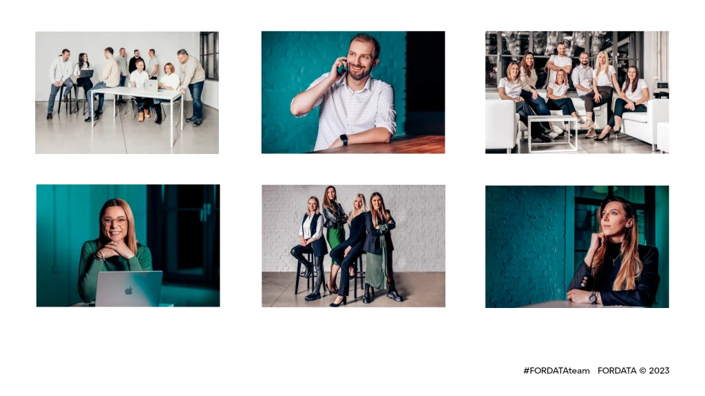
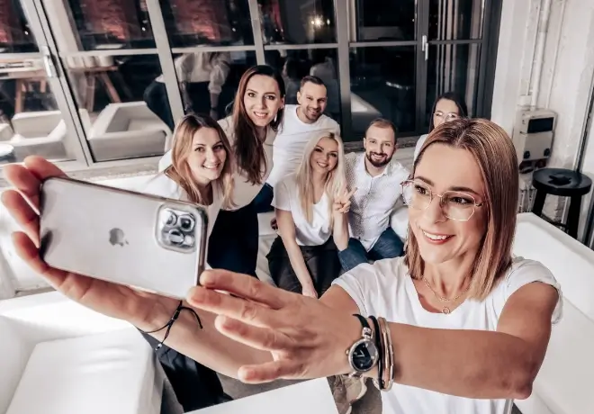
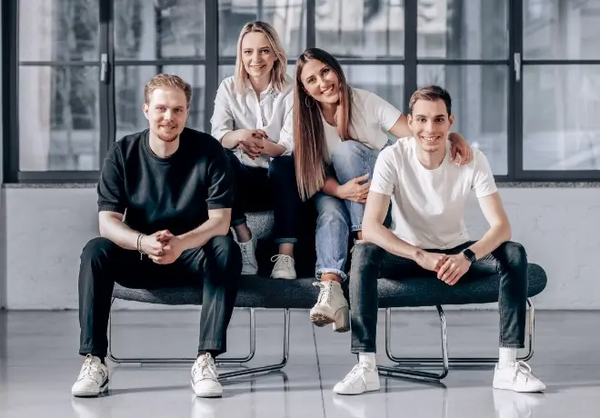
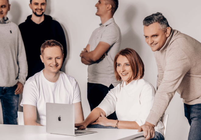
Fordata - more than technology. We invested in the team
However, the most important and certainly unique move in our industry was to give up stock photos and images from photo banks that are so often duplicated in other creations. We invested in the #FORDATAteam. You will see our employees in our ads, posts, and on the website. Throughout the process, this was an obvious step for us. If the greatest value of the brand is VIP service, if we say we know our customers by name and want to be transparent – let’s show our team. After all, our employees are the best brand ambassadors.
FOR speed, FOR security, FOR peace of mind, FOR you - Fordata
For the main page, a short animation was created, combined with a short video from the photo shoot, which is the quintessence of our way of working. It has remained unchanged. Our values have not changed. We only changed our approach to communication to better show that we are here for you.
Did you like the article?

In business, a creative soul who nonetheless looks at the brand and all processes holistically. Strategy and image design are my elements, while the notion of "living on the wave" reflects my spirit.
Do you want to exchange knowledge or ask a question?
Write to me : ![]() Katarzyna Alagierska page opens in new window
Katarzyna Alagierska page opens in new window
You must see the coverage from our photo shoot!
watch now watch now-
01 . FORDATA: 15 years of innovation, passion and relationships

The year 2024 is coming to an end and FORDATA is celebrating a very special anniversary – its 15th anniversary. Over these years, we have managed to grow from a small company in Poznan to become a leading Virtual Data Room solution provider in Europe.
05.12.2024
-
02 . Corporate Social Responsibility (CSR) - Why does it matter?

Fordata has been committed to modern and sustainable solutions since its inception. We fully understand the importance of CSR and are actively involved in social and environmental projects as part of our long-term strategy.
16.10.2024
-
03 . New product in Fordata's offer - Redact, a system for automatic document redaction

Discover Redact – the new product in Fordata’s offering. The system provides secure, automatic online document anonymization, supporting 18 formats, including PDF, Word, Excel, and PowerPoint. It ensures full compliance with legal regulations.
07.10.2024
-
04 . Fordata's involvement in the reactivation of the 'Dare to Dream' sewing workshop in Nairobi

Fordata supports the revival of the ‘Dare to Dream’ sewing workshop in Nairobi, helping women from the Mathare district build a better future.
08.08.2024
-
05 . Zero technical requirements - meet Fordata VDR 6.0
We have introduced new features to our Virtual Data Room system. Fordata Data Room version 6.0 is now available.
15.05.2023
-
06 . Board announcement: We are changing - rebranding of Fordata
We are pleased to inform you, our dear clients and business partners, we are changing for you. We will be presenting a new brand identity soon.
12.05.2023
-
07 . FORDATA among the Top10 Polish FinTechs by MyCompany Polska
In terms of development and adaptation of fintechs, Poland is currently among the most dynamic markets in Europe. Local pro…
01.06.2021
-
08 . FORDATA awarded in Stevie Awards 2021!

The International Business Awards, known as the The Stevie Awards, is an American business award annually awarded to companies…
04.02.2021
-
09 . FORDATA awarded as Top10 PropTech Solution Provider 2020!
FORDATA has been placed among the ten best providers of solutions for the Real Estate industry in 2020 by CIO Applications…
25.11.2020
-
10 . Product Update - what's new in FORDATA system?
Since the beginning of the year, our IT department has introduced a lot of new features and improvements in the…
08.05.2020
-
11 . Wakeboarding not so terrible. FORDATA on the wave!

FORDATA outdoor trips are slowly becoming a tradition. This time, as part of the company’s integration, we drove…
30.08.2019
-
12 . Our Goal - The Fastest Virtual Data Room!
Speed is at a premium in M&A processes. This is why over the last year we have improved many system functions to maximize its time efficiency. It’s part of our philosophy, thanks to which we…
18.07.2019
-
13 . How FORDATA Data Room Works?

Are you interested in how the VDR project works in FORDATA? What is our secret of delivering excellent customer service? We have previously…
12.07.2019
-
14 . FORDATA Competitive Advantage – Customer Support

Have we already mentioned that we are available 24/7/365? At FORDATA we are extremely flexible…
12.07.2019
-
15 . FORDATA wins the 2019 Premium Usability and Rising Star Award
FORDATA has earned the prestigious 2019 Premium Usability and Rising Star Award from FinancesOnline, a popular B2B software…
30.04.2019
-
16 . How to join our Referral Partner Program – FORDATA Virtual Data Room?

With regard to international expansion of our company, we are expanding the formula of the partner program and we invite…
01.02.2019
-
17 . FORDATA recognized with 2 IT Security Software Awards!
FORDATA got Two Awards through a renowned organization FinancesOnline, a fastest growing independent review platform.
01.02.2018
-
18 . FORDATA - Outstanding Customer Service!

FORDATA Team is flexible and understands your needs. Exceptional customer support distinguishes us among competitors.
21.09.2017